Slow Orbit Gives a Small Office a Poster With Space to Breathe
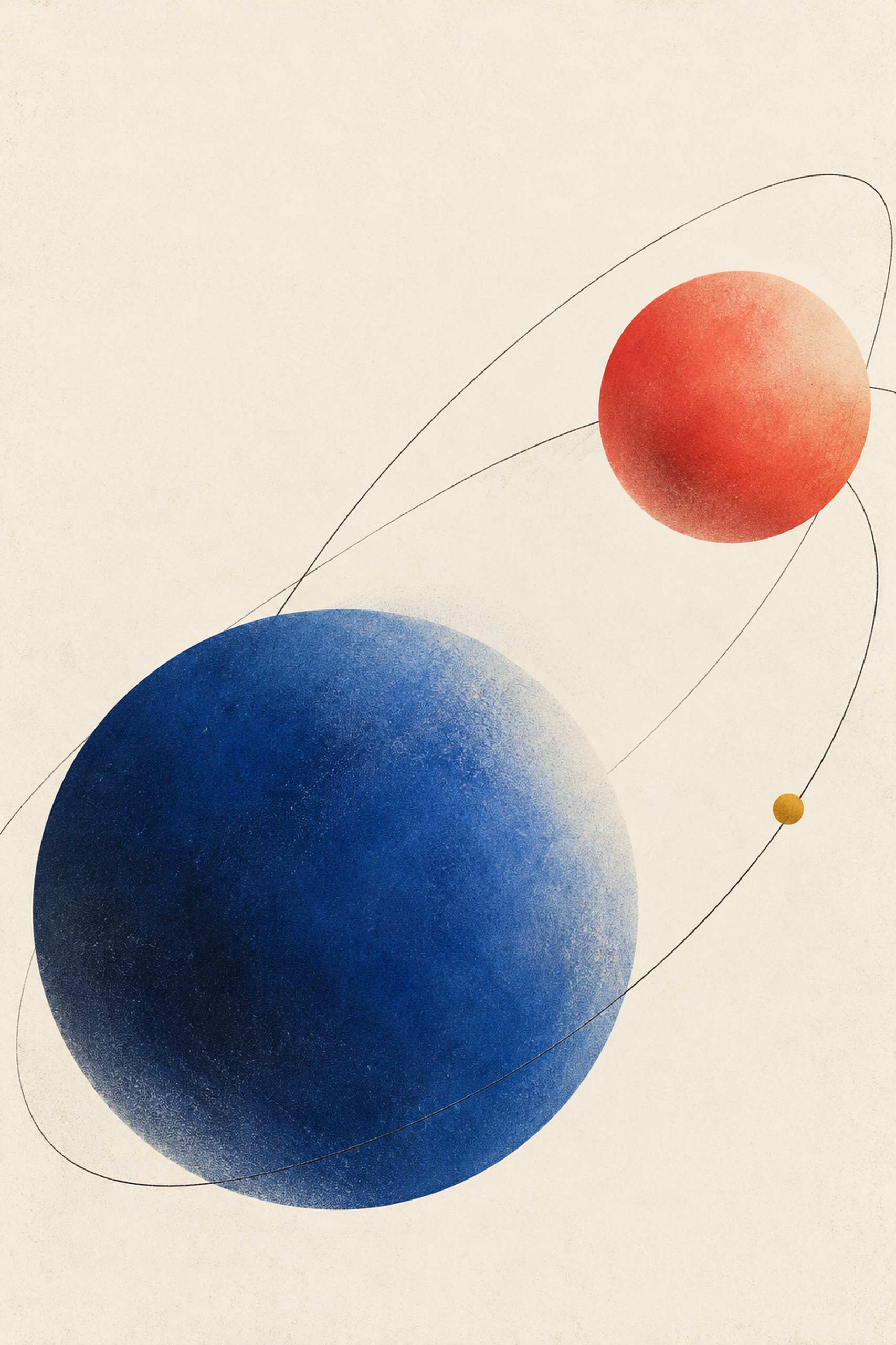
Some office walls already have plenty to say. A calendar, shelves, notices and the changing shapes on a monitor can fill the view before a picture is added. Slow Orbit 01 is intended for a different kind of contribution: a small number of colored forms with a great deal of pale space around them. Two disks and a few sweeping lines provide the structure. The empty area is not waiting for a quotation or a company logo. It is part of the work.
The blue disk carries most of the visual weight, while a smaller coral form answers it from another part of the field. A tiny yellow point gives one of the dark curved lines a local accent. The lines suggest orbits, but the arrangement is an invented abstraction rather than a diagram of a solar system. Sizes, colors and paths have been chosen for their relationship on the paper. There is nothing here to measure as astronomy. That freedom makes the forms useful for a quiet office picture: they can remain legible without asking the viewer to read labels or solve a puzzle.
Our illustrated office is an alcove with a pale wood desk, an open laptop, a compact dark blue chair and a slim metal lamp. The poster occupies the wall beside the work surface, where it is visible from the room entrance and can remain clear of the screen. Its narrow metal frame supplies a light boundary. A small coral shelf provides a limited connection to the warm disk without taking over the wall. The room retains the scale of a place someone could actually work in; the desk is not a ceremonial surface cleared of every useful object except a vase.
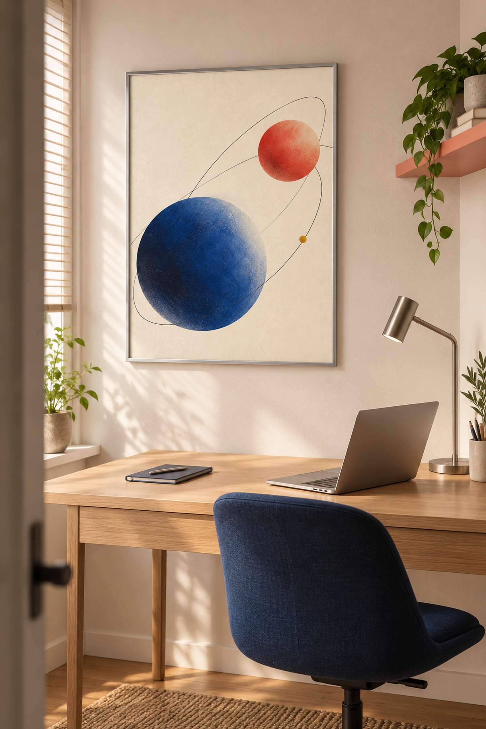
The blue chair makes one color relationship explicit, but Slow Orbit does not depend on that exact chair. With a black seat and plain shelves, the artwork could be the only source of blue and coral. In a room with existing warm wood, the pale field may be the more important connection, keeping the poster from feeling like an unrelated dark rectangle. I would look at the whole wall from the doorway before deciding what to repeat. The artwork’s small yellow point is particularly easy to over-explain with an unnecessary accessory. It is allowed to stay a small yellow point.
This collection extends the interest in open space explored by Quiet Signals in a reading corner, but the curved paths introduce a different sense of movement. The earlier work rests on a bar and a divided circle; Slow Orbit lets the lines pass through a much larger field. The effect is quieter than Concrete Rhythm’s optical gym poster, where broad bands fill most of the frame. Those differences give a reader a useful choice between kinds of graphic energy, rather than a list of styles that all produce much the same picture.
Scale can change the balance considerably. A small print may feel like a discreet object beside the desk, while a larger one turns the pale field into a substantial part of the wall. Compare templates for 30 by 45 and 40 by 60 centimeter image areas, adding the actual frame dimensions. These are proposed examples rather than measurements of the AI-generated office. Keep the full portrait composition when testing them. Cropping the quiet upper area to fit a convenient opening would change the proportion between the disks and the surrounding space, which is the main relationship worth preserving.
There is also no reason to hang the picture where it will spend the day behind a monitor. Check the normal screen position, the lamp’s movement and the sightline from the chair before choosing the final location. The room illustration suggests one solution; it does not test the dimensions of your equipment or prove how a physical print will look under a particular light. A paper template and a color sample are simple ways to make those choices concrete. The result need not announce itself as a productivity intervention. A desk can remain a desk, and the wall beside it can offer one unhurried composition to look at between more demanding things.