Quiet Signals Gives a Reading Corner One Clear Point of Focus
A restrained room still needs decisions. Remove enough objects and every remaining edge, color and gap becomes more conspicuous. Quiet Signals 01 is built for that condition: a circle divided between forest green and ochre, a dark horizontal bar, and a small red dot placed low and to the right. There is very little to describe, which makes the arrangement between those parts the whole point. The dot is small, but it is hardly shy.
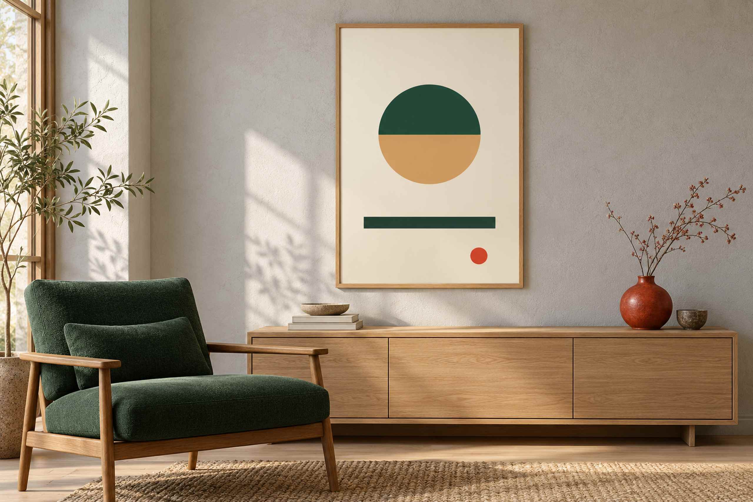
In the reading-corner illustration, the poster hangs in a narrow oak frame above a long, low wooden cabinet. A forest green armchair stands to the left, its timber arms picking up the cabinet and frame. A red-orange ceramic vase sits on the cabinet’s right side with a few fine branches extending upward. The light grey wall has a soft plaster texture, and morning light from the left throws plant shadows across it. Books and shallow bowls occupy the other end of the cabinet. The scene has Japanese-influenced restraint in its low furniture, natural materials and careful gaps, without pretending to reproduce a specific historical interior.
The print’s circle is the largest isolated form. Its upper half is dark green, its lower half a warm ochre, and its clean horizontal division gives it a quiet internal horizon. The green bar beneath it repeats that horizontal direction at a much wider scale. Then the red dot interrupts the balance, landing outside the central axis. That displacement is the part I would protect when framing the work. Cropping the margins or trying to center the dot within a new opening would remove the tension that makes the simple arrangement worth looking at.
The room translates the artwork through selective repetition. The chair carries the green into a substantial soft surface; the wooden furniture relates to the ochre without attempting an exact color match. The vase answers the red dot in both color and position, though it is larger and more textured. This is a fairly deliberate styling choice. If the room already contained a red object elsewhere, I would test that before adding another. A single accent can connect two things; five accents can become a set of instructions about where to look. The poster does not need to manage the entire room.
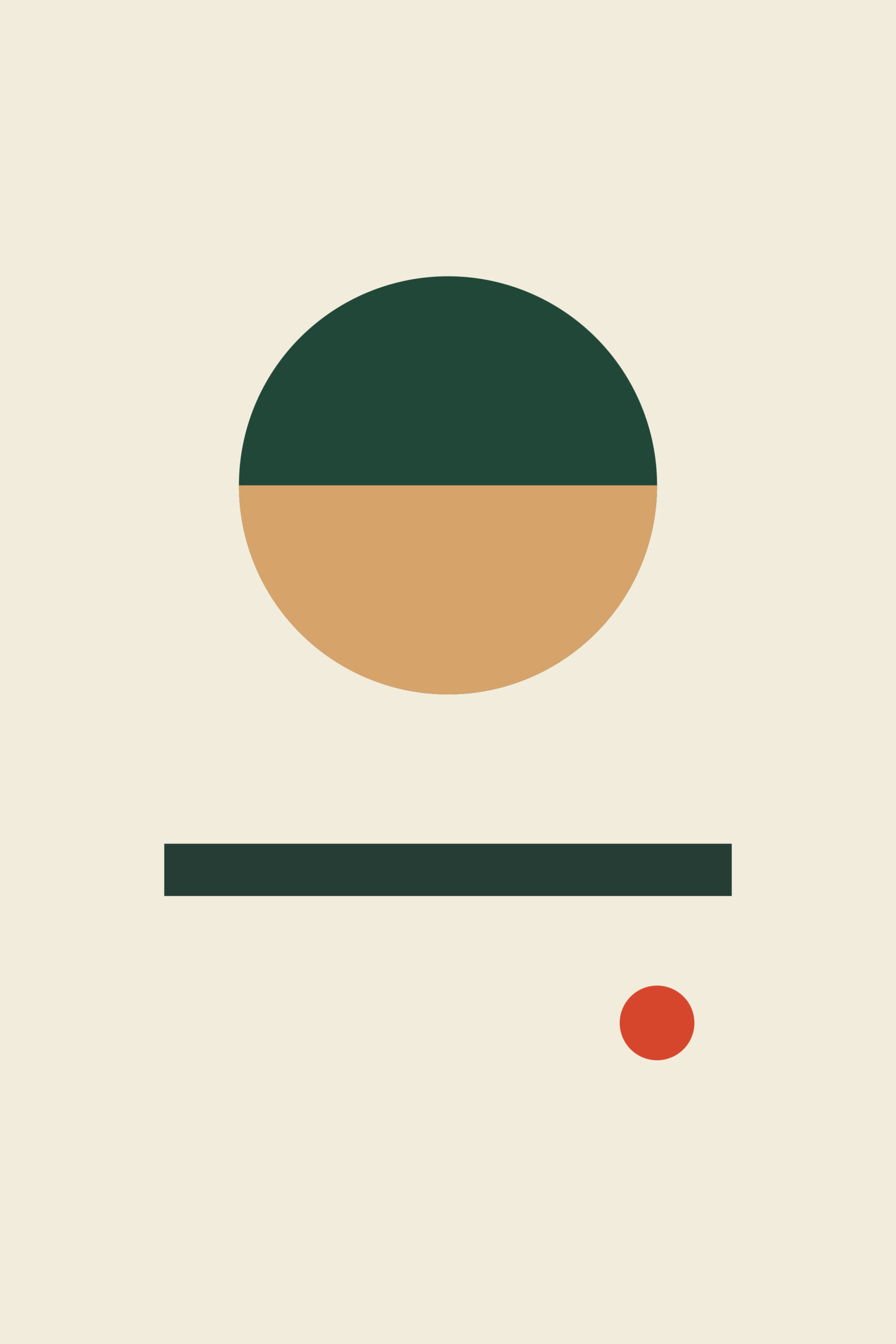
Negative space is doing two different jobs here. Inside the artwork, the cream field separates the circle, bar and dot so each remains distinct. Outside it, the wall around the frame allows the composition to remain one coherent object rather than a gap-filler between shelves. I would avoid squeezing a second small frame into the narrow strip beside it merely because the wall is available. There may be a good reason to build a group later, but an empty patch is not, by itself, a problem. It is also fine for an ordinary home to have books, glasses and a charging cable nearby. Restraint does not have to mean clearing all evidence of the person who reads there.
To plan a similar arrangement, test a 40 by 60 centimeter image area with the actual outside frame dimensions added. The artwork is 2:3; a different frame ratio should be handled by an appropriate mat rather than by silently cutting away part of the design. A broader cabinet may allow a larger print, but it does not automatically require one. Compare the picture with the visible furniture grouping, including the chair and vase, rather than following a fixed fraction of cabinet width. These are suggested planning dimensions, not measurements supplied by the room illustration. A paper template and a view from the doorway will reveal more than repeatedly moving a tiny thumbnail around a screen.
The illustrated room is an AI-generated concept, and the flat artwork preview is the reference for the graphic itself. Its warm paper field may look different beside a bright white wall or under an evening lamp. Check a physical sample before committing to a final print if color relationships are important to your scheme. The oak frame shown here is a material connection to the furniture, but a narrow black frame would make the picture more independent and a green one would make its perimeter another colored element. I would begin with oak, live with the paper template, and allow the smallest red mark to remain the slight disturbance that it is. For a more exuberant use of green, blue and red, Paper Garden takes the botanical route. Quiet Signals leaves more unsaid.