Kitchen Mischief Puts a Sardine Tin on a Cobalt Kitchen Wall
A sardine tin is a small, practical object with an unusually good collection of shapes. There is the curved rim, the folded lid, the repeated bodies of the fish and the yellow interruption of a lemon. Kitchen Mischief 03 treats those ingredients as a still life, giving an unbranded tin enough space to become the main subject. Against cobalt cabinetry, the poster’s warmer ground has a useful independence. The kitchen can be blue without requiring the artwork to disappear into another blue rectangle.
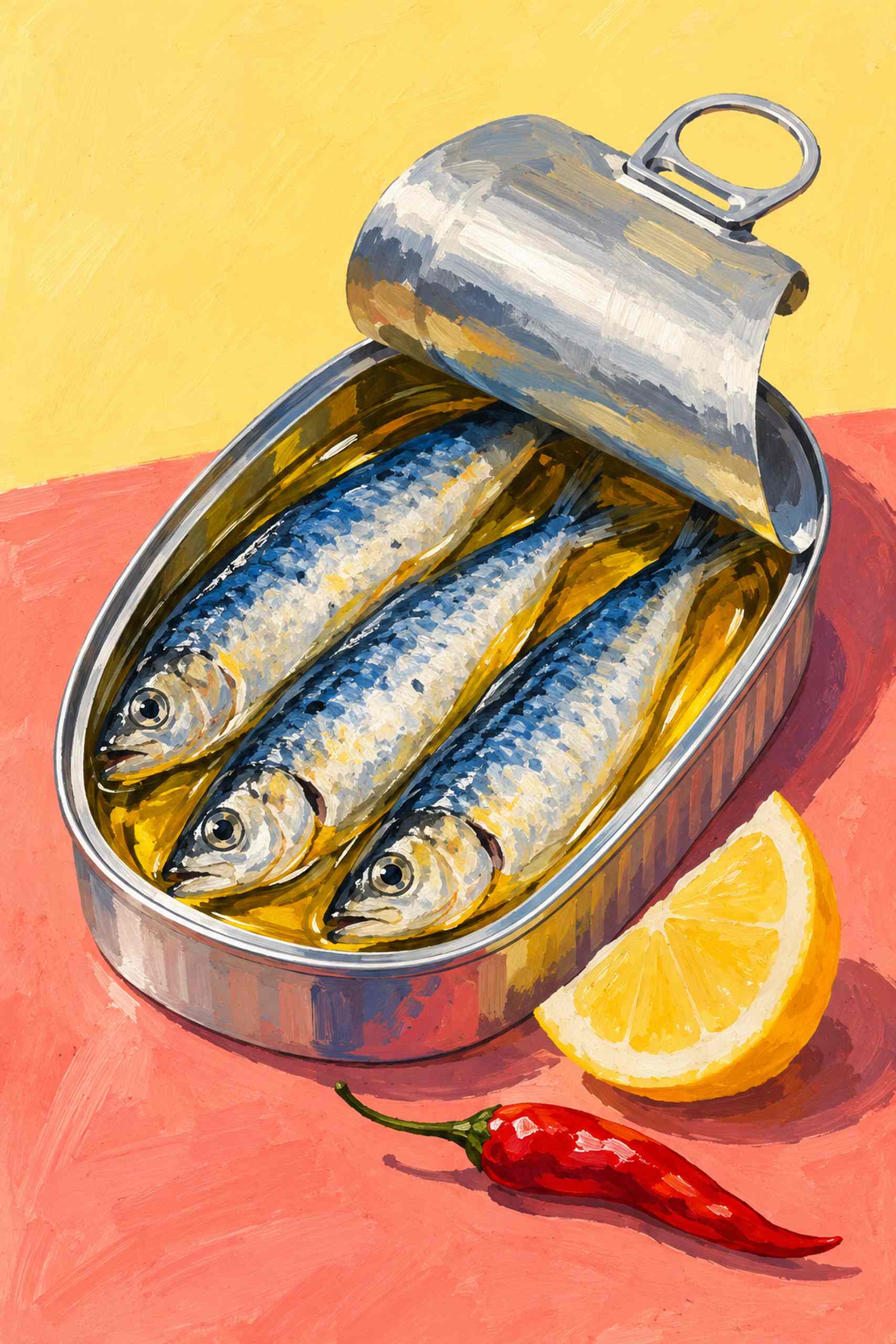
The picture uses a slightly elevated view of the tin, so the contents and the curling lid can participate in the same composition. Silvery-blue fish sit against warmer oil color, while a lemon wedge and a small red chili introduce different kinds of edge and intensity. The tabletop is pink-coral rather than a literal kitchen surface that has to be reproduced in the room. Its painted-looking texture gives the metal a softer setting. There is no label to read or familiar package to recognize. The subject is an original food illustration, not a branded product recommendation or a photograph of a meal prepared for the site.
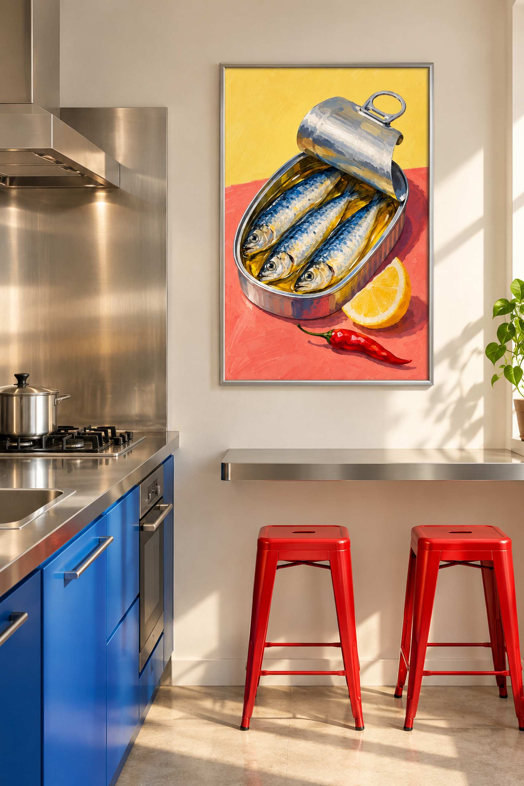
The room concept is more assertive than a pale breakfast nook. Cobalt lower cabinets meet steel work surfaces, with the poster placed on a separate dry wall above a modest breakfast shelf. Red stools make a small, strong connection to the warmer marks in the image. The narrow silver-colored frame relates to the kitchen’s metal without adding another dominant hue. It is a contemporary arrangement that lets useful materials look useful. There is no need to surround the picture with decorative tins to prove that the food subject belongs in a kitchen.
The food theme in Kitchen Mischief can take quite different forms. The red pepper depends on one large silhouette, while the floating citrus turns a familiar still life into a small visual impossibility. The tin is more concerned with overlapping materials and compact repeated shapes. That distinction helps the collection remain a body of work rather than a recipe for changing the central ingredient in the same layout. Here, the little curl of the lid has as much compositional value as the fish.
I would choose the frame after looking at the actual metal finishes nearby. A brushed silver edge can connect with a countertop or shelf without pretending to be an exact match. Black would give the warmer poster field a firmer outline, and natural wood would make the arrangement less industrial. None requires changing the cabinetry. The important boundary is between the image and the wall immediately around it. That is where the tin’s pale ground either separates clearly or settles into the background, and it is more consequential than matching a small object on the counter to the lemon.
For a small eating shelf, test a 30 by 45 centimeter image area plus the actual frame dimensions before ordering. A larger version may work on a broader wall, but it should be checked from the stools as well as from the kitchen entrance. Those are proposed sizing examples, not dimensions measured from the generated scene. Keep the physical print away from actual heat, steam and splashes according to the materials and appliance requirements in the real room. The illustrated dry-wall position is a design proposal, not a tested clearance or a guarantee that ordinary paper belongs beside cooking equipment.
A printed sample will still be needed to judge the warm ground and steel-blue fish under the kitchen’s light. The web preview cannot prove the final paper, color or glazing. What the concept does offer is a less predictable relationship between food art and a working space: cool cabinetry, a warm image and metal appearing in both. I would leave the rest of the accessories comparatively plain and let the breakfast shelf earn its place through use. The sardines can provide the detail. Nobody needs to reorganize an entire kitchen around a lemon wedge.