Paper Garden Takes a Japanese Inspired Plum Branch to a Sheltered Balcony
The wall at the end of a narrow balcony is easy to overlook. It is too far from the living room to belong fully indoors, yet it often has more visual presence than the railing or the view. Paper Garden 02 gives that wall a branch rather than another shelf. A few coral blossoms, a dark angular stem and a pale blue wash are enough to make a sheltered outdoor corner feel considered. There is no need to turn the whole balcony into an elaborate garden scene. The real plants can handle that part.
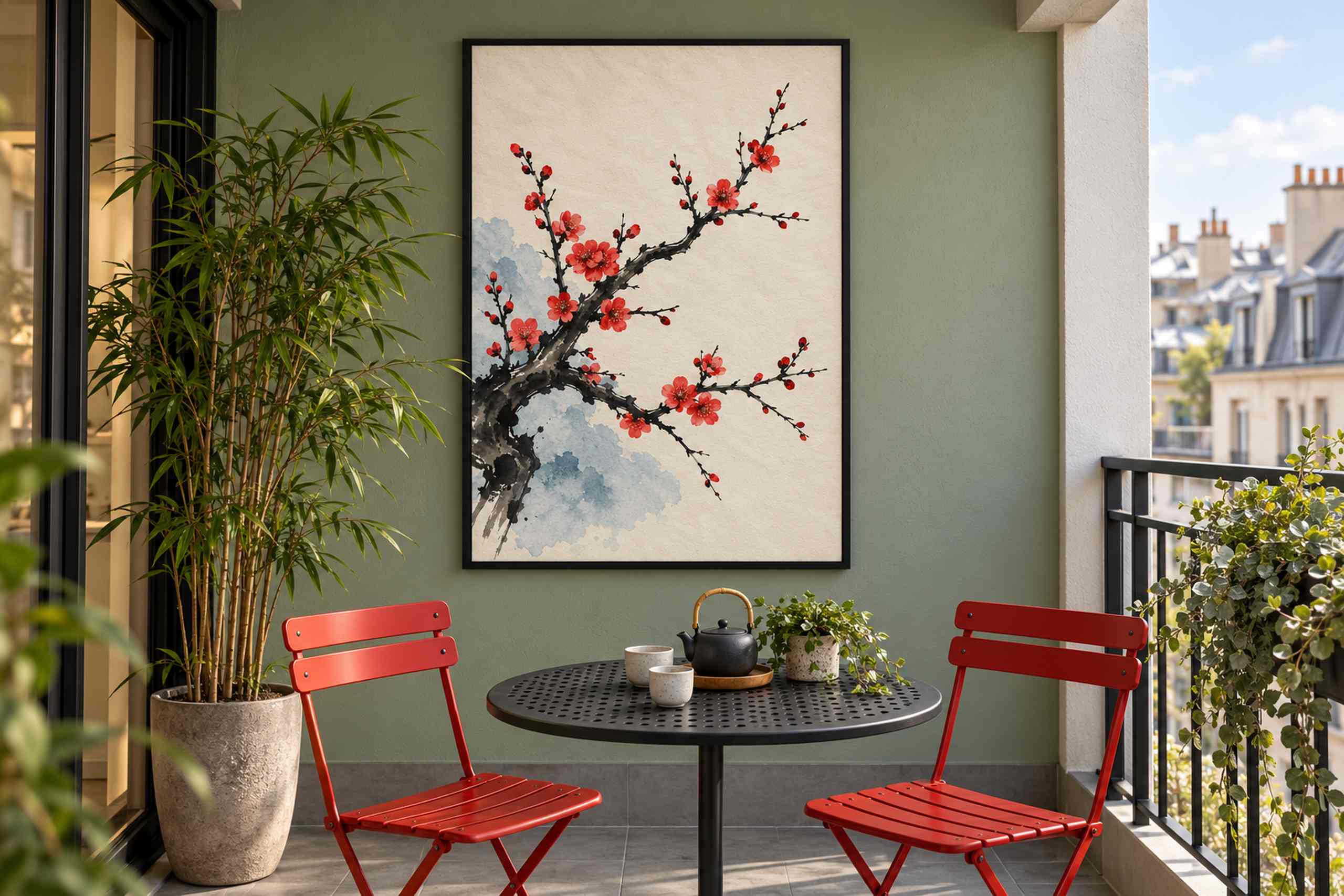
Our illustrated setting is a compact roofed balcony with a protected back wall, a dark metal table and two bright red chairs. The print sits against a muted green surface, its thin black frame relating to the table rather than to the chair color. Daylight reaches the corner from the open side, leaving enough shade around the artwork for the cream paper field to read as its own shape. The plum branch rises across that field in an uneven diagonal. Its small red flowers create points of attention, while the open space above and beside them lets the wall remain visually light. A narrow balcony already contains plenty of edges; the picture does not need to supply another dense pattern.
This second Paper Garden work takes a different approach from the broad colored leaf silhouettes of Paper Garden 01. Here, the interest lies in the variation of the branch, the unevenness of the ink-like marks and the loose relationship between blossoms. The blue wash belongs to the image without describing a precise sky or ground. It adds a cool interval beneath the warmer flowers. Viewed as a flat artwork, the branch is more expressive than symmetrical, and the apparent paper texture gives the empty areas something to do beyond being blank.
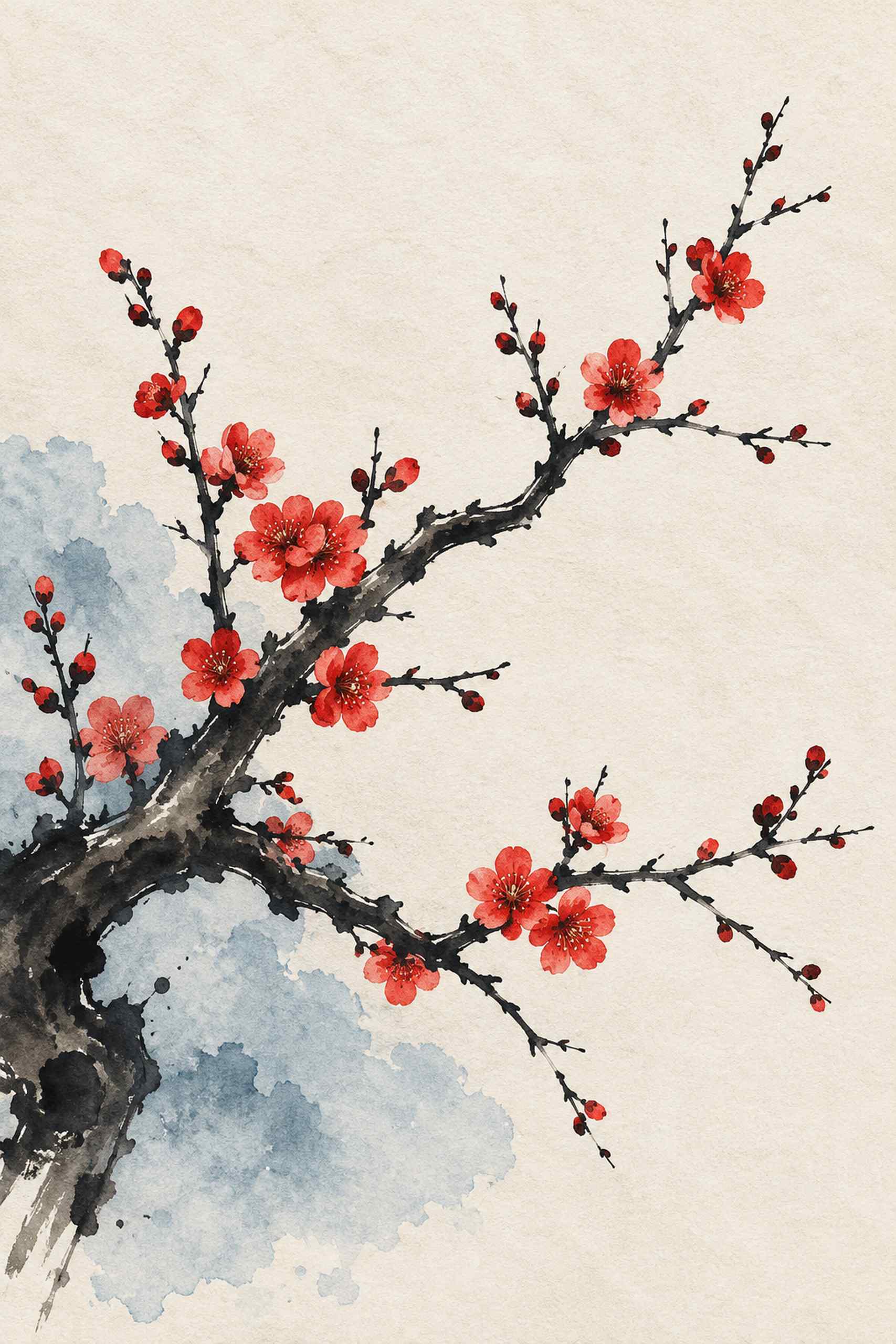
Japanese ink painting provides one point of reference for the botanical treatment, but this is an original contemporary poster, not a reproduction of a historical painting. There is no borrowed inscription, artist seal or decorative string of characters. I prefer that directness: the branch has to carry the composition on its own. It also avoids treating a whole culture as a collection of interchangeable decorative symbols. The useful design idea here is specific enough already, an asymmetrical flowering branch with generous space around it, interpreted through a limited contemporary palette.
The red chairs make the strongest connection to the blossoms, though they do so with a much larger area of color. On a balcony that already has black or plain wood furniture, the flowers could simply be the only red element. That would create a different emphasis without making the arrangement incomplete. The muted wall is similarly optional. A white wall would give the cream paper more contrast, while a dark green wall would make the light field feel brighter. Test a sample beside the wall rather than judging the palette from a phone screen in the kitchen, where the light may be entirely different.
For a worked sizing example, start with a 30 by 45 centimeter image area and add the actual frame dimensions. A larger 40 by 60 print might suit a broader back wall, but leave enough clearance for a seated person’s head and for the chairs to move. These are planning examples, not measurements extracted from the illustration. Check the picture from inside the apartment as well as from the balcony table. If the door frames the view of the artwork, a small sideways adjustment can matter more than increasing the print size. Keep any proposed fixing position clear of door travel and existing services.
Shelter is a real condition, not a decorative adjective. An overhead roof does not make ordinary paper, glazing or a frame suitable for outdoor humidity and wind-driven rain. Before using a physical print here, check the actual exposure and the display materials’ specifications. A protected indoor wall immediately beyond the balcony door may be the more practical interpretation, giving much the same visual connection without placing the work outside. Our image is an AI-generated room concept, not a durability demonstration. What is worth borrowing is the relationship between the dark branch, the small red blossoms and the furniture, a light composition that gives a compact corner something to look toward.